Responsive Images with TYPO3 8.7+
On a typical website, responsive images are able to
- reduce bandwidth on mobile devices due to smaller image sizes
- reduce loading times on mobile devices, also due to smaller image sizes
- produce sharper images for devices with high dpi screens (such as Apple’s „retina“ screens)
If properly configured, responsive images are clearly a win-win feature: Users like fast, mobile-friendly websites and website owners like satisfied users.
How do responsive images work?
Ask two web developers what responsive images are and you get three opinions. The good news is that, while the response to this question was quite complicated a few years ago, nowadays it should be straightforward.
The HTML5 standard specifies three new features to implement responsive images in modern web browsers. Actually, the browser support is pretty good, which is why responsive images should be a nobrainer. And for older browsers, there is a polyfill for responsive images called picturefill.
The srcset attribute
With the srcset attribute you can provide additional image files to the browser. These files have to show the identical image and should only vary in their dimensions. This is important because the browser is free to choose which image will be used in the current environment. While current browsers base their decision mainly on the current viewport size and the pixel density of the screen, this may change in the future. Thus, you cannot use srcset to define which exact file will be used on a specific device!
The following example defines an image with three additional image files, one 400 pixels, one 800 pixels and one 1200 pixels wide.
<img
  src="image.jpg"
  srcset="
    image@400.jpg 400w,
    image@800.jpg 800w,
    image@1200.jpg 1200w
  "
  alt="alternative text"
/>
The sizes attribute
The sizes attribute gives the browser hints about what image should be used in the current environment. Without a sizes attribute, the browser doesn’t know in which size the image will be displayed on the page and can’t decide intelligently which image file should be downloaded.
<img
  src="image.jpg"
  srcset="
    image@400.jpg 400w,
    image@800.jpg 800w,
    image@1200.jpg 1200w
  "
  sizes="(min-width: 800px) 800px, 100vw"
  alt="alternative text"
/>
The sizes query in this example translates to the following:
If the viewport width is larger than 800 pixels, this image tag will be 800 pixels wide. If the viewport is less wide, the image tag will fill the whole viewport width.
Thus, the 1200w file will only be used on high dpi screens.
The picture tag
Last but not least, there is the <picture> tag. Apart from some other useful features, picture allows something called art direction. This means that you can provide different images based on CSS media queries – usually the viewport width. This is exactly the feature srcset can’t provide: To force the browser to load a specific image at a defined breakpoint.
This allows you to use a square image on mobile and a wide image on desktop screens. The following example would display desktop.jpg on screens above 600 pixels and mobile.jpg on smaller screens:
<picture>
  <source srcset="desktop.jpg" media="(min-width: 600px)" />
  <source srcset="mobile.jpg" />
  <img src="image.jpg" alt="alternative text" />
</picture>
As you might have guessed, both srcset and sizes can be used for each <source> tag, which makes the <picture> tag both powerful and complex.
What changed with TYPO3 8.7?
With TYPO3 8.7, the image cropping tool in the backend was extended to allow multiple crop variants for each image:
- Feature: #75880 – Implement multiple cropping variants in image manipulation tool
- Feature: #79812 – Allow overriding cropVariants for Image Manipulation
- Feature: #79883 – Add cropVariant support to TypoScript rendering of images
This feature is the missing element to generate real responsive images with TYPO3. For example, it would allow you to define two cropping configurations for one image – one for mobile devices and one for desktop:
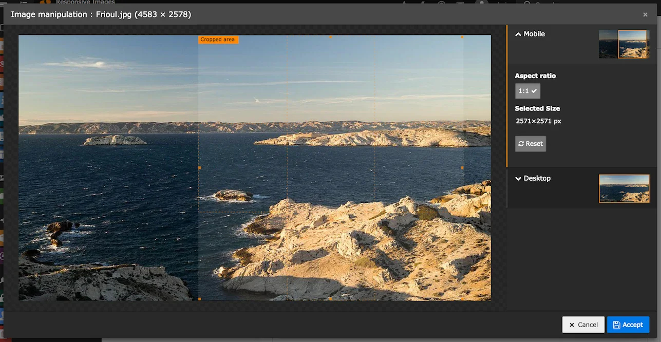
These crop variants can be defined either in TCA or in Page TSconfig, as described in the feature documentations linked above.
How to render responsive images?
While these changes are all nice and fine, what is missing in TYPO3 8.7 and above is a way to render those images in the frontend in a convenient way. This is why we at sitegeist developed an extension called sms_responsive_images. It contains the necessary Fluid ViewHelpers to render both <img> tags with srcset/sizes and whole <picture> tags. It also tweaks the rendering of fluid_styled_content to generate responsive images by default, so your content images get upgraded to responsive images automatically.
For custom content elements, such as Mask elements or Extbase plugins with their own Fluid templates, you can use the included ViewHelpers to tweak the image rendering:
Img tag with srcset/sizes
The following snippet would generate the <img> tag with srcset and sizes I used in the example above.
<sms:image image="{image}" srcset="400, 800, 1200" sizes="(min-width: 800px) 800px, 100vw" />Another and probably the better way to achieve this would be to simply set the width attribute for the tag:
<sms:image image="{image}" srcset="400, 800, 1200" width="800" />This serves two purposes: It sets a reasonable default width for the fallback image (otherwise it would be the original image size) and it generates a sizes query based on the specified width.
Picture tag
To generate a <picture> tag, you have to combine the new crop variants with some additional configuration:
<sms:image image="{image}" width="800" breakpoints="{
  0: {'cropVariant': 'desktop', 'media': '(min-width: 600px)',
    'srcset': '600, 800, 1000, 1200, 1400, 1600'},
  1: {'cropVariant': 'mobile',
    'srcset': '400, 600, 800, 1000, 1200', 'sizes': '100vw'}
}" picturefill="false" />
(I added the picturefill attribute to get a simpler and cleaner result, usually you wouldn’t do that.)
This would result in the following <picture> tag:
<picture>
  <source
    srcset="
      desktop@600.jpg 600w,
      desktop@800.jpg 800w,
      desktop@1000.jpg 1000w,
      desktop@1200.jpg 1200w,
      desktop@1400.jpg 1400w,
      desktop@1600.jpg 1600w
    "
    media="(min-width: 600px)"
    sizes="(min-width: 800px) 800px, 100vw"
  />
  <source
    srcset="
      mobile@400.jpg 400w,
      mobile@600.jpg 600w,
      mobile@800.jpg 800w,
      mobile@1000.jpg 1000w,
      mobile@1200.jpg 1200w
    "
    sizes="100vw"
  />
  <img src="image.jpg" width="800" alt="" />
</picture>
To recap, this is how the image would behave:
- For mobile screens under 600 pixels, it would choose one of the mobile@ images based on the viewport width and pixel density of the screen.
- For desktop screens above 600 pixels, it would choose one of the desktop@ images.
- If the viewport width is smaller than 800 pixels, it will choose based on the whole viewport width.
- If it’s larger, 800 pixels will be the maximum width.
A screen at 1000px viewport width and a pixel density of 2 would likely display desktop@1600.jpg. A screen at 400px viewport width and a pixel density of 1.5 would likely display mobile@600.jpg.
How can I get this?
You can download the extension either via composer:
composer require sitegeist/sms-responsive-imagesor from TYPO3 TER:
https://typo3.org/extensions/repository/view/sms_responsive_images
To setup the extension, you should take a look at the documentation:
https://docs.typo3.org/typo3cms/extensions/sms_responsive_images/
You can also take a look into the code at GitHub:
https://github.com/sitegeist/sms-responsive-images
I really hope that this extension will help to spread the usage of responsive images in the TYPO3 community. With images being the largest files on most websites (apart from audio/video of course) and always increasing mobile usage of the world wide web, it should be a goal for all of us to serve the user the fastest loading and smallest possible website while still having great image quality. And we can achieve that with responsive images.