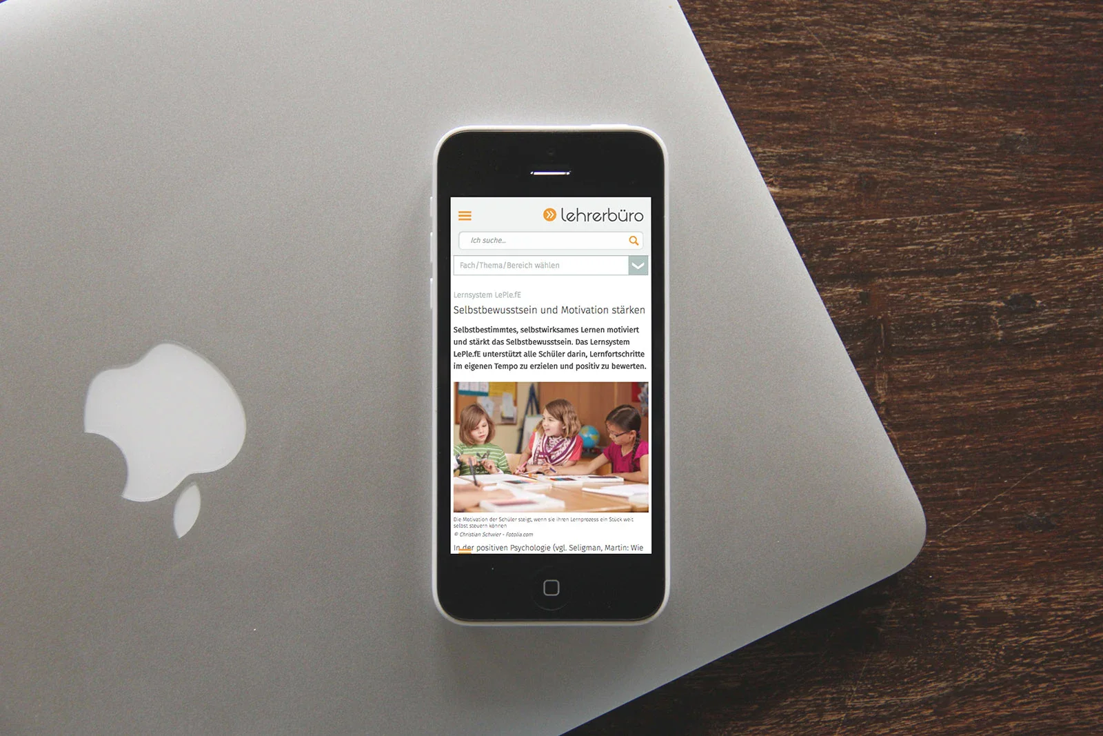
8 rules for mobile design

Just a decade ago, designing for the web meant designing for a desktop computer. For some time now, it has also meant designing for mobile devices. According to Statista, there were 3.9 billion unique mobile internet users in October 2018, and more than 50% of global website traffic was generated via cell phones. Great web design is no longer a luxury, it's a necessity.
However, creating a great user experience for mobile users requires more than just creating a responsive web design. In this article, you can learn the basic design principles for mobile sites.
1. Build up targeted experience
Mobile users are very goal-oriented users. Every time they visit a website, they have a specific task they want to accomplish. And they expect to get what they need really quickly. How can you achieve this?
Imagine your ideal users: Much like building a house, building a website starts with a solid foundation. And the foundation for great web design is the knowledge you have about your users. User research should be one of the first steps in product design. You need to find out exactly who your users are and what they want to achieve. Once you know your users' wants and needs, you can create a customer journey that you know will perfectly meet their expectations. Then, when you conduct thorough user testing, make sure you have achieved these goals.
Refine the UX in relation to your core objective: what do you want to achieve with this website? Finding the answers to this question is another important task when creating a mobile web experience. Are you trying to encourage user engagement, get users to buy products or sign up for a service? Clearly state the goal and consider how you can reduce the number of steps a user needs to take to achieve it.
2. Adapt your content to a smaller space
Content has the greatest value for most websites. It's the main reason people visit them. When it comes to mobile web design, it's almost impossible to create a desktop version first and then simply replicate it for mobile devices. It's important to design websites with mobile users in mind. This means we need to adapt content and functionality to fit the user's screen size and habits. What steps can you take to achieve this?
- Avoid horizontal scrolling. Users can scroll vertically, but not horizontally. For this reason, there should be no pages that require horizontal scrolling to display content. Fixed-width elements are one of the most common reasons for horizontal scrolling. Überptherefore check that you don't have content that only displays well at a certain viewport width.
Single-column layouts help manage the limited space on a small screen and also allow easy scaling between portrait and landscape. Users can easily scroll websites vertically, but not horizontally. For this reason, there should be no pages that require horizontal scrolling.
- Make sure that users do not have to zoom. Users can easily get frustrated if they have to zoom in or out to read a text or see an image. Design your mobile website so that users never have to resize. Use a readable font size: 11 points is the absolute minimum size for text. This size allows users to read text at a typical viewing distance without zooming. Choose fonts that scale well. If reading the website is required, use sans serif fonts such as Helvetica or Roboto.
- Use a finger-friendly design: When designing a mobile website, keep in mind that visitors use their fingers instead of a mouse arrow and human fingertips are larger than a mouse pointer. Strive for a finger-friendly interface where each interactive element is the appropriate size. Also consider the relative distance between touch targets. If interactive elements are too close together, mobile users may accidentally tap the wrong button with their finger. Make sure that the size of the buttons is correct and add enough space between the buttons to prevent this.
- Product images should be able to be enlarged. Many studies have proven that people learn predominantly visually. Most people are able to understand concepts better when they are conveyed in this way. Therefore, using images in web design is a great way to quickly summarize important messages. Images play an important role on e-commerce websites. People rely on product images when making a decision. It's important to not only provide high-quality assets, but also make them expandable so users can easily see them in detail. Offer to enlarge the entire image and not just part of it.
- Be careful with promotions and ads. They can easily overshadow the content. While the message of the ad may work for some visitors, in most cases users will skip it and move on to more valuable information. This phenomenon is known as banner blindness.
- Make it easier to find contact information. Mobile users often visit websites to find contact information. Depending on the urgency, users may want to call a company, fill out a contact form or find the address. For e-commerce websites, the phone number should be available directly on the home screen.
3. Optimize the content for scanning
It's common knowledge that users don't read online, they scan. When a new visitor is on a website, they first scan the page and break down the content into digestible information. It is possible to simplify this task for users by following a few simple rules.
- Consider the order in which you provide content on a page: Readers read from top to bottom. Therefore, it is important to keep the important information at the top of a page and move the rest of the hierarchy down accordingly.
- Reduce clutter. Prioritize user interface content, reduce distractions by removing unnecessary functional and decorative elements. Strive for a minimalist style, as this makes it easier for users to focus on the task at hand.
- Avoid long blocks of text without images. It is very likely that large amounts of content will be skipped. Use headings, paragraphs or bullet points to break up the text.
- Place important elements visually in the foreground so that visitors can see them immediately. Emphasize elements with different sizes, spaces or vibrant colors.
4. Develop a comprehensible navigation
Guiding users should be a top priority for every website. After all, the most compelling content is useless if users can't find it. For this reason, it is important to invest in developing a solid navigation system by following these steps.
- Use familiar navigation patterns
When creating a navigation mechanism for your website, you should remember one simple rule: don't reinvent the wheel. It is always better to rely on the navigation patterns that most users are familiar with (e.g. the top navigation bar or the hamburger menu) than to create your own unique navigation system (e.g. a gesture-based navigation system). By creating familiar navigation, you help users rely on their previous experience when interacting with your product.
- Limit the total number of navigation options
Don't include too many options in menus. An extensive menu may work well for desktop websites, but does not fit with mobile design. Since not all navigation options are available in a visible area of the screen, mobile users are forced to scroll through a list of options. Consider how you can present as few menu items as possible. Ideally, the menu you design should contain no more than seven different categories.
- Prioritize navigation options
Organize the navigation based on how users function. The most popular navigation options should be displayed at the top and the most important actions should be available in a visible area of the screen.
- Use clear labels
Each navigation option should have a clear and concise label. Avoid jargon - the navigation you design should not contain terms that your visitors do not understand. Clear labels give visitors the ability to predict the outcome of their actions.
- Make sure interactive elements look like interactive elements.
When designing buttons and links, think about how the design communicates the invitation to interact. Do users understand the element as an interactive object? The way an object looks tells users how it should be used. Visual elements that look like links or buttons but are not interactive (e.g. underlined words that are not links or rectangular boxes with words that are not buttons) can easily confuse the user.
- Providea search function.
If you operate a complex website with a lot of content or functions, make sure you provide a search bar for easy navigation. By implementing the search function, you offer mobile users who arrive at the website with a specific question quick access to information and functions. Don't hide the search option in the menu. It should be the first thing visitors see on your pages.
- Make it easy for users to return to the home page.
Visitors expect to return to the home page when they tap the logo at the top of a page and are frustrated when this doesn't work.
- Keep your user in a single window.
Avoid functions that open a new window. Some users have trouble switching between windows in a mobile browser and may not be able to find the previous page.

5. Avoid interruptions
Locks cause friction. And friction is a user's worst enemy. Fortunately, there are simple things you can do to get around them.
Don't interrupt visitors: Large pop-ups are one of the most common types of interruptions on the web. For a long time, such banners were dedicated to advertising messages, but lately many websites have been using distracting pop-ups to get permission to use cookies. Regardless of what information you want to show your visitors, make sure it doesn't distract from the overall experience.
Don't just let users leave your website: Identify places in the customer journey that could lead a user to continue researching outside of your site, then provide content or features to keep them on your site. A promo code box on e-commerce websites is the most common example of visitors leaving a website to find the coupon. It is much better to offer some coupons directly on the website to prevent such behavior.
Do not force users to register. Asking people to register before they can see information or use an online service causes high interaction. Registering too early can cause users to leave the site. Before visitors provide personal information, they want to get an idea of what a website has to offer them.
To develop a user experience with the lowest conversion barriers, mobile websites should allow visitors to browse content without having to sign up. For e-commerce websites, it's important that a user can also shop as a guest.
Make it easy to switch to another device to continue shopping or browsing. Don't think of mobile devices as standalone experiences. A typical user has multiple devices such as a desktop computer, a cell phone and a tablet and expects to have a seamless user experience when using your product on all of these devices. For example, many users only use mobile devices to search for products and then switch to desktop to convert. Users expect to continue from where they stopped on mobile.
Here are some things you can do to synchronize a user's current progress:
- Sync wishlists, favorites and the shopping cart for a user account
- Provide an easy way for non-registered users to save or share information across devices (e.g. the option to send the link to an email).
6. Design forms efficiently
Filling out forms is one of the most common tasks on the web. It's rare that users don't have to fill out forms. Since this is a ubiquitous practice, the ability to fill out a form painlessly is critical. Here are some tips you can use to keep friction to a minimum.
Minimize input on forms: The less data a user has to provide, the more enjoyable their web experience will be. Use these pointers to reduce the number of keystrokes and inputs that users need to make:
- Minimize the total number of fields. Always keep forms as short and simple as possible by removing unnecessary fields. Only ask what you really need to know.
- Use auto-correct, auto-capitalization and auto-complete to reduce the risk of user errors.
- Avoid drop-down fields. Drop-down lists hide options and cause additional interactions. Users have to tap twice to select the correct option. If you use a dropdown field for a selection of options, you should replace it with radio buttons.
- Automatically move to the next field when a user presses enter.
- Minimize form errors with real-time inline validation.
- Use existing information to maximize the user experience. For example, you can pre-populate some fields such as the delivery address or payment information for your registered users.
- Think about offering alternative input mechanisms. Consider which device features can be used to provide a better user experience. For example, instead of asking users to enter credit card details, you can use the device's camera to scan the card and integrate systems such as Apple Pay and Google Pay to enable one-tap payment.
Mobile device users appreciate websites that provide a suitable keyboard for the field. This feature prevents them from having to perform additional actions. For example, if users need to enter a phone number, your website should display the number pad 0 to 9.
Set the HTML input types to display the correct keyboard. Here are seven input types relevant to form design:
- input type = "text" displays the normal keyboard of the mobile device.
- input type = "email" displays the normal keyboard and '@' and '.com'.
- Input type = "tel" displays the numeric keypad 0 to 9.
- input type = "number" displays a keyboard with numbers and symbols.
- input type = "date" displays the date selection of the mobile device.
- input type = "datetime" displays the date and time selection of the mobile device.
- input type = "month" displays the month and year selection of the mobile device.
Many websites automatically detect the user's location and use this information to provide relevant content. Allow users to change the location as in some cases they may want to see results for a different location.
7. Offer a consistent user experience
Consistency is one of the most important pillars of the user experience. Consistent design is user-friendly design. If you focus on consistent design, you will create more intuitive design. Always strive to make the website consistent both internally and externally.
- Internal consistency
Create a library of design assets and use them for all areas of your website. Fonts, buttons, links, icons and all other user interface elements must be consistent throughout the website to ensure visual recognizability. - External consistency
Make sure that the website you are designing is also part of a larger product family. For example, if you operate a mobile app, your mobile website should feel familiar to the users who use it.
8. Create YOUR best mobile website
All of the points mentioned here can be considered best practices. But just because something is labeled "best practice" doesn't necessarily make it the optimal solution for your own website. For this reason, it's always important to test your decisions. Make usability testing a mandatory part of your design process and improve the user experience regularly.