Minimalism in UI design

Simple does not mean primitive. Less is not vague. Small is not little. Space does not equal emptiness. In the book "The More of Less," Joshua Becker said, "You don't need more space. You need less stuff." Minimalism is being discussed today in various areas of life and work. What are the benefits and what aspects should be considered.
What is minimalism?
In fact, minimalism is a word with a wide-ranging meaning that is used in various fields. The Merriam-Webster dictionary defines it as "a style or technique (as in music, literature, or design) characterized by extreme simplicity". As it is applied to more and more fields, the key characteristics are preserved: meaningful and simple.
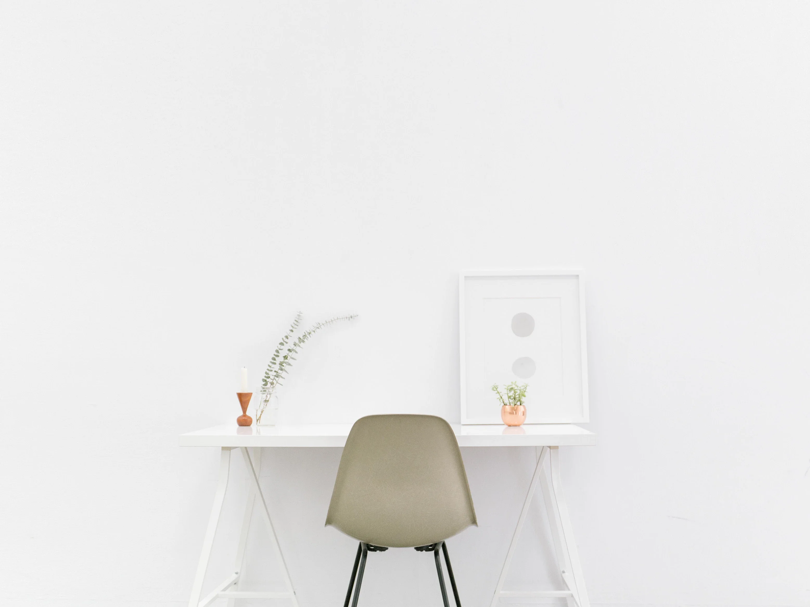
Minimalism as a form in visual design became particularly popular in New York in the 1960s, when new and established artists moved towards geometric abstraction in painting and sculpture. The movement found expression in the artwork associated with Bauhaus, De Stijl, Constructivism, etc. In various areas of visual art, the key principle of minimalism was that only essential components were retained in order to focus the recipient's attention and support the overall elegance. Lines, shapes, dots, colors, open spaces, composition - everything should serve its function by being carefully designed. Today, we can encounter minimalism in various areas of life: Architecture, art, photography, design of all kinds, literature, music and even food styling.
"A shape, a space, a color, a surface is something in itself. It should not be hidden as part of another whole. The forms and materials should not be altered by their context," says Donald Judd, an American artist closely associated with minimalism. Designers working in this style want the interfaces to be simple but not empty, stylish but not cluttered. They tend to use negative space, bold color and font combinations, and multifunctional details that make simplicity elegant. The dividing line between simple and primitive is very thin. For this reason, not all designers take the risk of trying this direction: Some think it looks too simple or cheap, others don't find enough ways to show a lot with fewer elements.
Characteristics of minimalism
The most important characteristics of minimalism, which are often mentioned by designers, are:
- Simplicity
- Clarity
- Expressive visual hierarchy
- High attention to proportions and composition
- High functionality of each element
- Large open space
- High attention to the core details
- Typography as an essential design element
- Elimination of non-functional or decorative elements
The list can certainly go on, but even the above points show that minimalism in the user interface is a very user-friendly trend. When used wisely, users can easily and quickly recognize the core elements of the user interface and design their user journey intuitively and purposefully. In addition, minimalist interfaces tend to look sophisticated and uncomplicated, which highlights aesthetic satisfaction as one of the desirable factors for a good user experience.
Minimalism in digital design
Minimalism is one of the most widespread trends in website and mobile application design today. The main points to consider can be described with the following approaches.
Flat design
Flat design has become a major supporter of minimalism in modern digital products in recent years. The most striking feature of this direction is the use of flat, two-dimensional visual details as the opposite of very realistic and detailed skeuomorphic shapes. Flat design usually uses fewer elements and curves to avoid highlighting, shadows, gradients or textures. This approach makes it possible to create images, buttons, icons and illustrations that look good at different resolutions and sizes. Designers can thus improve the usability and visual harmony of user interfaces.
However, the terms "flat" and "minimalist" should not be used interchangeably, which is unfortunately common today. They are not the same. "Flat" describes the style of icons, illustrations, buttons and other visual elements of the user interface in terms of color gradients, textures, shadows, etc. "Minimalist", however, has a much broader meaning and deals with the layout in general, its composition, colors and color palettes, contrast and all visual techniques applied to it. Flat can therefore be described as one of the design techniques used in the minimalist approach to creating interfaces.

Monochrome or limited color palettes
Color is a feature with great potential in interface design, as it can be used to create both informational and emotional connections between product and user. Designers who work minimalistically tend to make the most of color choices, and in most cases they limit the color palette to monochrome or minimal hues. This strengthens the chosen colors and does not disturb the user with too much variety.
Such an approach is efficient in interfaces that focus users' attention on specific actions such as buying, subscribing, donating, etc. Moreover, in psychological terms, colors usually convey certain associations and emotions perceived by users.
Bold and expressive typography
Typography in minimalist design is considered one of the key visual elements not only to inform users about the content, but also to set the style and enhance visual performance. When choosing fonts and applying them succinctly to graphics, designers usually pay close attention to their choices and test font pairs, sizes and combinations extensively. Fonts, along with color, are considered a strong graphic element that contributes to the overall impact and emotional message.
Limiting the choices
One of the strengths of minimalism in interactive user interfaces is the increased user attention it generates. Because they focus on functionality and simplicity, sites and applications of this type generally do not overload users' attention with decorative elements, shading, colors, details and movement. Therefore, they support a high attention rate and allow users to solve their problems faster when navigating through the website or app.
Prominent thematic visual elements
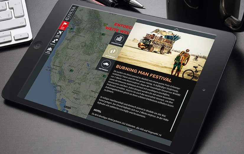
When working with minimalist user interfaces, designers often use only a few images. But those that are chosen are then truly eye-catching, engaging and informative. This approach is preceded by a long and thorough search for the "right" image so that the graphic covers all these functions and immediately creates the desired mood. The photo or illustration itself must also follow the principles of minimalism, otherwise choosing the wrong image can ruin the overall layout integrity and consistency.
Reduced and intuitive navigation
Navigation in minimalist interfaces presents another challenge: Designers must strictly prioritize navigation to show only the elements with the highest importance. There are various techniques for hiding part of the navigation. However, it must be ensured that users can still easily find what they need. This is one of the reasons why a minimalist approach can be criticized: With insufficient presentation and testing, solutions such as hamburger menus and hidden layout elements can lose some users on their journey through the website. Obviously, this is not a good basis for a positive user experience. Therefore, any navigation solution should follow the "measure three times and then cut once" philosophy.

Use of white space
White space (also known as "negative space") in digital design is the term that is more about space than color. In minimalism, this is a more effective way to create sophistication and elegance and highlight the important core elements. In terms of a monochromatic or limited color palette, white or negative space plays the biggest role in creating enough contrast and aiding legibility.
Grids
The grid system in minimalist interfaces can help make the layout look highly structured, especially if the website has a lot of homogeneous content, such as on overview pages in online stores. Another advantage is that such grids are technically very responsive.
Contrast
Following the philosophy of boundaries and simplicity, minimalism relies heavily on contrast as a tool for good visual performance. The choice of colors, shapes and placements is often based on contrast as the main feature.
Conclusion
It is easy to see that minimalism offers a number of advantages and a good approach to creating user-friendly interfaces. However, this does not mean that minimalism should be applied everywhere: Every goal should be achieved by the right means. One thing is certain: the more minimalist the interface, the more time and effort the designer should invest to make it clear and functional. The elegance and beauty of minimalism should therefore always pursue the general goal of providing a positive user experience.


