Mobile optimization as a success factor: the 3 most important points for good responsive design

Here are the most important points for an optimal user experience on mobile devices.
- Mobile is the main usage channel for your users
- Always optimize for people
- Understand the reading behavior
Mobile is the main usage channel
Of your users In your website statistics, e.g. from Google Analytics, you will have noticed not only the large number of users with mobile devices but also the much shorter dwell time? So the motto is: don't just optimize your online channel for mobile use, but above all make your content relevant for this target group!
If you are not yet convinced, here are a few statistics:
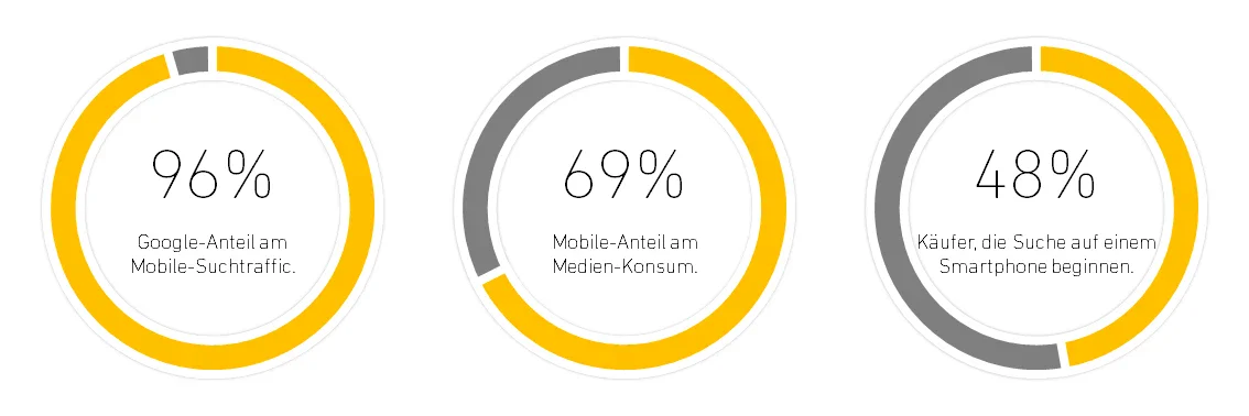
- Google accounts for 96% of mobile search traffic.
- 69% of media consumption is on smartphones.
- 48% of buyers started their search on a smartphone with a search engine.
(www.jodynimetz.com, 2018)
Always optimize for people
Search engines such as Google try to find the best results for your query. The ranking criteria are increasingly geared towards human user behavior. This is precisely why you should always put people at the center of your online marketing activities. Specifically: the users of your target group. The navigation, selection of topics, content, information and graphic presentation must correspond to the users of your target groups.
For this reason, your brand and product specifications as well as your corporate design should always be precisely aligned with these needs. The result does not have to be your personal favorite - your target group has to like it! Ideally, this should be measured early on and then continuously through user and A/B tests. Feedback from your users is the best criterion.
Mapping your own company structure or internal processes in order to impress or satisfy your manager or colleague has no place in your digital marketing mix!
Understanding reading behavior
... or rather: not reading! It is known from neural research that people try to avoid any kind of effort that is not purposeful. This also and above all applies to reading and understanding texts. The more concisely a message can be formulated, the better. Conversely, a detailed text always makes sense if the user wants to delve deeper into a topic. This is the case on news sites or product reviews, for example. This makes it clear that we need to differentiate between the various types of content and the associated user goals.
The three basic goals for using a website are
- Find:
Searching for specific information or products and providers. The focus here is on scanning the structure and navigation. Search facets and filters can support users in their search. - Inform:
Read and compare information on services and products. Here, attention should be paid to a thematic structure of the content and digestible preparation. - Transactions:
Buy, download or directly use products or services online, such as films or music. In this phase, interaction elements in particular should be clearly and recognizably integrated into the user interface.
The better you succeed in assigning a page to these goals and optimizing it for them, the better the user experience will be for your customers. A very effective tool for mapping the user's goals is the customer journey analysis, which helps us to understand what the user expects and how they interact with a product.
The three most important optimization points
1. Mobile First
Have you ever faced the challenge of optimizing huge tables of data for cell phone displays? Then you will have noticed that there is much less space available on a smartphone!
This makes it all the more important to divide it up well and sensibly. In addition, these devices are not operated with a mouse, but with a finger, and gesture controls such as swiping or pinch-to-zoom must be taken into account. Maps are usually scrolled with two fingers and zoomed with a pinch. Mobile First is therefore above all an awareness of cross-deviceltspresentation and interactions.
You should bear this in mind with "mobile first":
- Structure content and cluster / navigate it thematically (sections with meaningful headings, page navigation: link sections)
- Design the depth of information modularly if required (detailed information to expand, link to further information, make tables sortable, etc.)
- Adapt interaction elements to learned operating patterns (swiping, pinch-to-zoom, use HTML5 input fields, allow horizontal scrolling of tables, immediately validate entries, make telephone numbers clickable, etc.)
2. Optimize content
Always keep the reader in mind when creating or revising content: Is the basic topic of the text immediately clear? If you are talking about a specialist topic, you can dispense with long explanations - if in doubt, link to a glossary or other external explanations. Always argue your position on controversial topics and make your stance on these issues clear.
These points will help you optimize your content:
- Is the headline "to the point"? Does it reflect the content?
- Are the sections structured sensibly and do they have meaningful subheadings?
- Is the content easy to navigate? Are topic sections clearly separated from each other visually?
- Can figures and data be clearly presented and substantiated using illustrations or graphics?
3. Technical optimization
Even if this is the last item on the list, it is a very important one. Technical optimization can have an extremely positive effect on the user experience and your ranking in the search engines. Your goal should be to keep the loading time under 2 seconds. The interaction of the page should also be smooth and close to the performance of native apps. This is how you can proceed:
- In addition to bandwidth, the response time of the server plays a key role. Use caching mechanisms for page delivery, for media and for the APIs mentioned.
- Ensure a clean and lean code structure, if possible use Frontend frameworks that are optimized for mobile pages. Reduce the payload: combine individual scripts and stylesheets and compress the result.
- Optimize the execution of client-side javascripts. The aim should be to end DOM rendering as early as possible. (Ideally less than the 2 seconds mentioned) For example, you can reduce the number of scripts executed or use fast frameworks (such as React.js, Angular or Vue.js) for interactive pages.
- Define meaningful viewports for your project and your target group with corresponding fluid or responsive grids. If the information is more important than the design and an individual corporate design, the use of AMP (Accelerated Mobile Pages) should be considered. (for example journalistic or scientific content)
- Use suitable image resolutions that are optimized for the display for the respective viewport and device properties. For example, you should only load small images with smaller file sizes on small viewports and only display high-resolution images on Retina displays, etc. You can find out more about this theme here, for example:
https://blog.kulturbanause.de/2014/09/responsive-images-srcset-sizes-adaptive/#chapter4 - Use mobile-optimized compression methods for images and videos to save bandwidth during transmission. Many content management and store systems allow individual compression levels to be applied via configuration. For example TYPO3, Neos and Shopware.