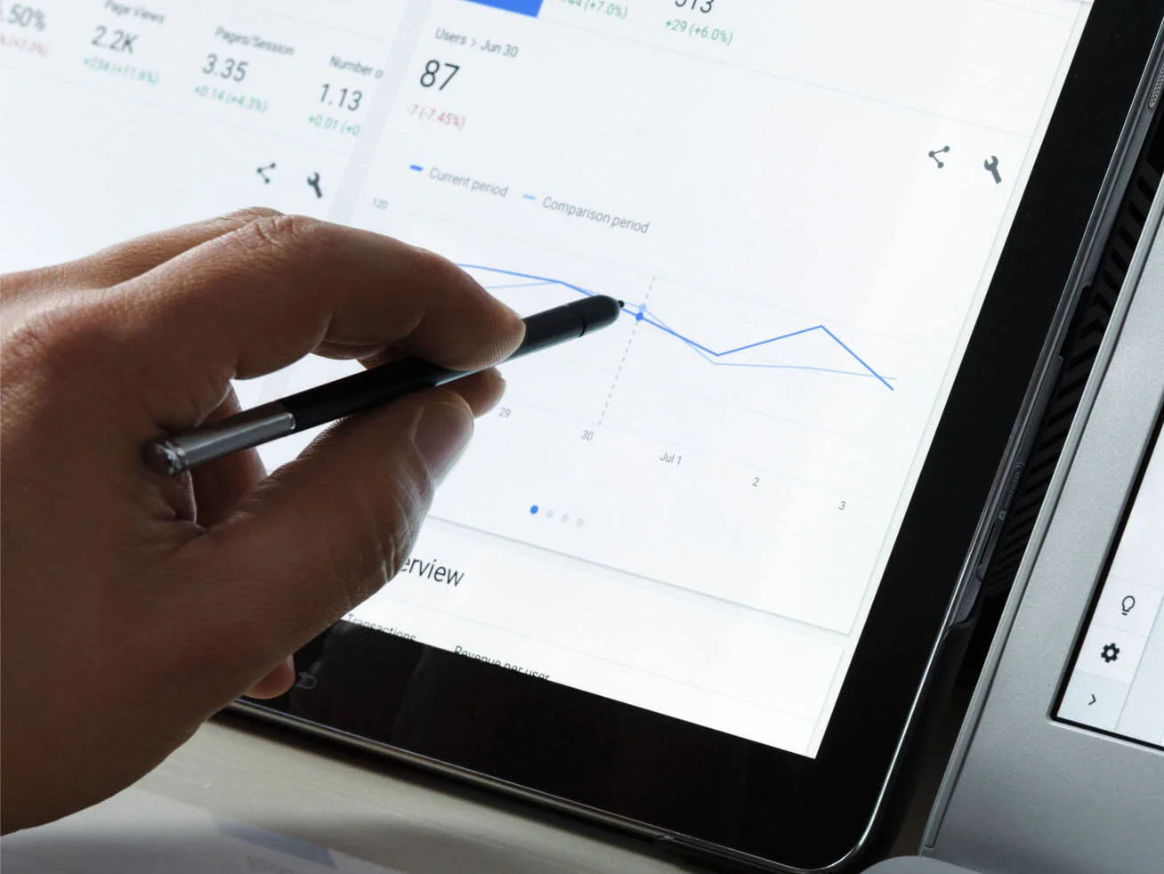
Looker Studio: Data visualization in the Google Dashboard
Data is the foundation of an online marketing strategy. However, it is often not only used by the marketing team, but also by other stakeholders such as management, sales or product management. Google's Looker Studio is used to make it available to all these interest groups at any time, automatically and in an up-to-date format. It enables data from various tools to be brought together and visualized in an understandable way.
What is the Looker Studio?
Looker Studio is primarily a tool for data preparation and data visualization. You can integrate various data sources such as Google Analytics, Google Ads, Search Console, MySQL, Google Sheets, LinkedIn, Facebook, etc. Over 600 connectors allow you to easily link these data sources with Looker Studio and merge the data into a dashboard.
Share Google Dashboard
To make the dashboard easily accessible to different interest groups, there are various ways to share it:
- Automated sending - so you can send management the latest figures on a regular, automated basis.
- Looker Studio access - manage which colleagues have access to the dashboard and which have read permission and benefit from interactive visualizations.
- Integration on your website - so you can make the figures accessible to website users or (password-protected) colleagues.
Define the right key performance indicators (KPIs) for the dashboard
The aim of a dashboard should be carefully considered. After all, an overloaded and unstructured dashboard no longer fulfills its purpose as a communication and analysis tool and quickly leads to disinterest among stakeholders. Our projects therefore always start with a workshop or a kick-off meeting to cluster all expectations and goals and then create a concept. The basis for such a dashboard should always be a good tracking system.
The following questions are used to determine the KPIs (key performance indicators):
- What is the company's primary goal?
Define the top goal (brand awareness, sales, etc.) and set 1-2 key performance indicators against which it will be measured. The most important stakeholder group for this should be the management.
Example: Increase in sales
- Who has an interest in the dashboard (or the figures)?
Determine who should see and use the dashboard. Different areas can be created for different interest groups, e.g. sales or marketing.
- What medium-term goals do the stakeholder groups have in order to achieve the primary goal?
Individual goals should be defined for each stakeholder group. These goals should contribute to the primary goal and be defined using the SMART method.
Example: Improve the ranking positions of product keywords by 10% in the coming financial year.
- Which key performance indicators (KPIs) are used to measure these objectives?
Definition of the KPIs by which the objectives of the stakeholder groups are measured. Again, each target should have no more than 2-3 KPIs, but these can be very specific.
- Which KPIs are really important for measuring success and deriving actions?
Analyze the KPIs identified and question their priority and usability.
Do you need support and advice on dashboards? Then please contact us at:
Visualizations you should know
Looker Studio offers a wide range of charts and widgets that can be used to visualize the data. However, in addition to choosing the right chart, it is also important to combine or model the data in such a way that you get the most added value from it.
Many of the linkable tools and connectors already offer a wide range of data combinations. Since the Data Studio, there are also various filters and control elements that can be applied separately to the visualized data.
However, despite this wealth of ready-made options, there are always limits and you can then resort to a Google Sheet, which calculates, combines or selects the desired data. In the following, however, we would like to show you a few data formats that often meet the needs of our customers.
Organic performance - What do your customers ask?
Organic visibility is an important indicator of the success of search engine optimization, which is why various data sources such as Google Analytics, Sistrix (visibility index) and the Google Search Console are used to measure it. Looker Studio's various visualization options allow you to clearly prepare the journey of organic traffic. The journey can be visualized from the first key figures from the Google SERPS to the final purchase.
As already mentioned, asking the right questions is essential for the development of KPIs. But have you ever asked yourself what questions the customer is actually asking about your product or company? Or for which questions does Google display your website? You can prepare this very quickly with the Search Console, Looker Studio and a little regex.
This data can be interesting for finding ideas for Blog, optimizing category pages or expanding the FAQ page.

Keeping an eye on the e-commerce funnel
In e-commerce, it is important to know how customers move around your website until they ultimately complete a purchase. In addition to the sources, various events are also recorded in order to record and optimize the touchpoints of the customer journey.
An important and often underestimated section is the registration and payment process. It is one of the most important sections, as the customer has already decided to buy one or more products at this point. The topic of "1Click", which Amazon has coined, should also be an incentive to make the checkout process as simple as possible.
Could you say in your store how many clicks come to nothing because the customer has forgotten a field or a tick? Or do you know the bounce rate in your store? No other section of the journey has more influence on sales - so don't leave it unobserved. The following illustration shows the visualization of a complex order process, which we use to ensure that problems are identified quickly:

ROAS as a KPI - why manual calculations are more honest
In digital marketing, you use a wide variety of channels to draw attention to yourself. Users don't just come via one Google service, but are spread across different channels. The challenge is to make users aware of you there, to offer products and services and to create trust. We use different tools for this, which represent a new data source in our dashboard. Regardless of whether this data comes from analytics, Google Ads or social media - as soon as it comes to PPC data, the interest of superiors is aroused. You should therefore approach such a dashboard transparently, honestly but also well prepared.
For our projects, we therefore look at the most relevant figures (costs, sales, conversions and ROAS) and discuss them in great detail. This is because the success of paid campaigns is highly dependent on various factors such as budget, target group, content (text, images), etc., over which we marketers do not always have any influence.
In addition, campaigns are often divided into performance and brand, which means that although they support each other, not every campaign delivers direct sales. Individual consideration is therefore essential for the respective channels, but a general overview can still be helpful. To do this, the data from the different data sources must be merged manually.
Manual calculation is also essential to ensure that all expenses and costs are included. However, this leads to key figures such as ROAS reflecting actual success. The result in the dashboard may look simple, but it is an honest and transparent key figure for communication with the management.

Conclusion
Looker Studio is a great tool for keeping an eye on data and key figures at all times. It offers a range of features and options for combining and visualizing data. When creating it, you should make sure to work in a structured way and focus on the essentials. Share information with stakeholders so that you can react quickly to problems and derive meaningful tasks from the insights gained.
We are happy to support you with tracking and data visualization so that you can get the best out of your data.